
Phones and tablets
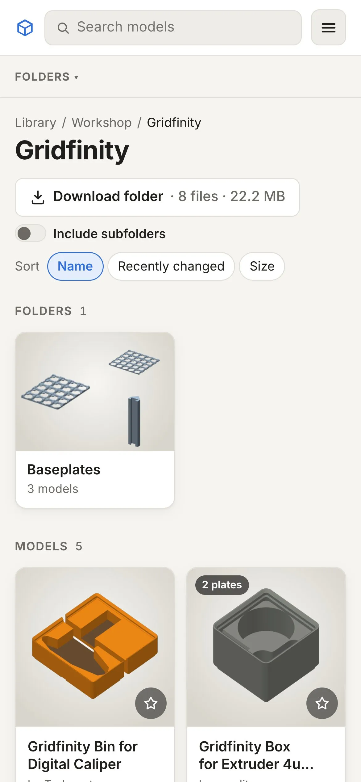
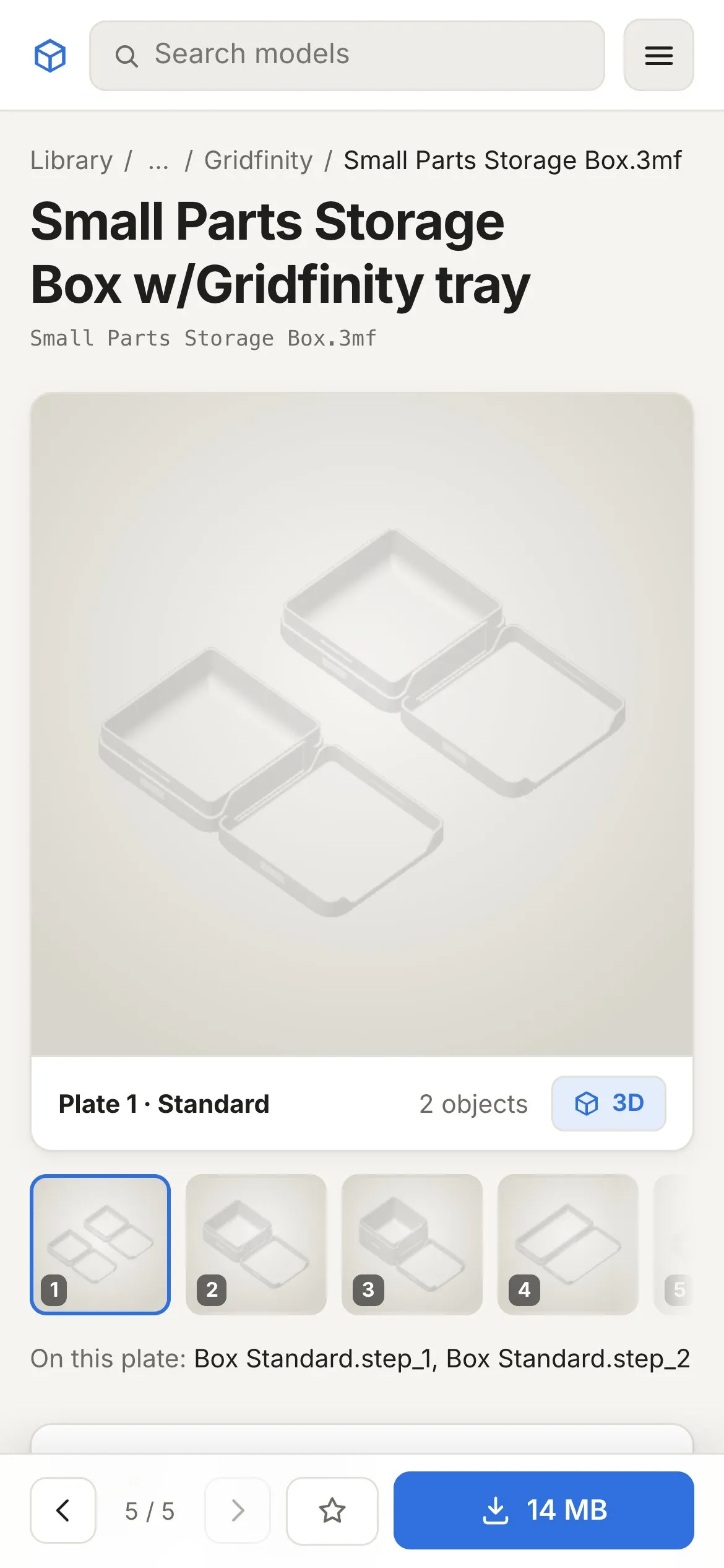
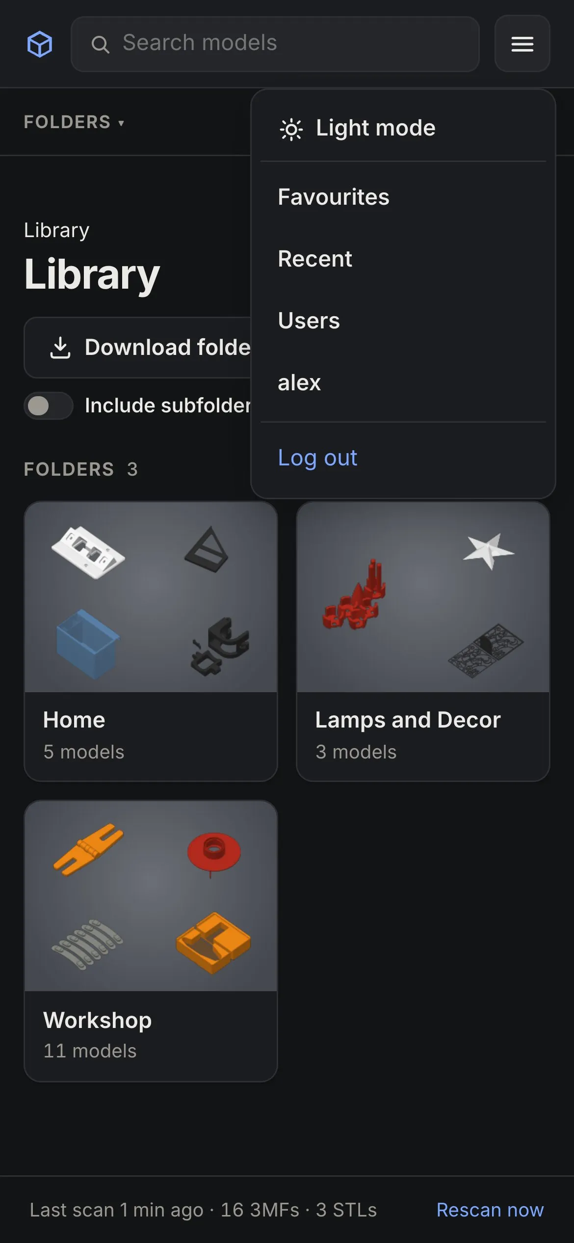
The site is made to work on a phone as well as on a big screen: one-row header with a menu, two cards per row, and on a model’s page the buttons stay at the bottom of the screen while you scroll through plates and photos.
Install it as an app
Section titled “Install it as an app”The site can be added to your home screen, where it opens in its own window without the browser bars:
- iPhone/iPad (Safari): Share → Add to Home Screen.
- Android (Chrome): menu ⋮ → Install app (or Add to Home screen).
- Desktop (Chrome, Edge): the install icon at the right of the address bar.
It’s still the website: it needs a connection to your server, and you log in the same way.
What’s different on a phone
Section titled “What’s different on a phone”- Open in … isn’t shown: phones have no desktop slicer. Download the file and share it to your printer’s app if it supports that.
- The 3D viewer works with touch: drag to rotate, pinch to zoom, two fingers to move.
- The plate strip scrolls sideways; long folder paths are shortened to “… / parent / folder” (tap the “…” for the full path).